Smartphone review
OnePlus 12: A quality alternative to expensive flagship devices
The popular brand celebrates a decade with a device that demonstrates its advantages: as powerful as the competition with excellent cameras and a battery that lasts almost two days. It's not cheap, but its price is still significantly lower than the competition
Top Line:
The OnePlus 12 is a very successful device that competes with more expensive competition. The screen is excellent, the performance is great, the battery lasts a long time and it charges quickly (with the right charger), but there is still room for improvement in terms of protection against water.
The OnePlus 12 is not a cheap device, costing usually over $1,000. However, for a device of this size and with similar specifications and performance, the competition charges another $300-400.
You won't find new AI capabilities or a removable pen here, and in this respect the OnePlus 12 is almost boring, but definitely not basic: it does the job excellently, reacts quickly and doesn't heat up even when you load it with tasks. What else do you need, really?
Details:
The OnePlus brand recently celebrated a decade of existence. According to the company, its motto, Never Settle, refers to always looking for ways to create a better device and user experience. As part of its decade celebrations, the company launched its new flagship device - OnePlus 12.
Since the brand was launched, it has been talked about as a "flagship device killer". When other companies tried to "kill" the iPhone, compete with it and perhaps even surpass it, OnePlus aimed to offer powerful and user-friendly devices at a reasonable price.
We tested the OnePlus and found that even after ten years, during which the smartphone market has undergone many upheavals, the new model proves that the brand remains faithful to this goal and does an excellent job.
More Smartphone Reviews:
Design and structure: Mainly a matter of taste
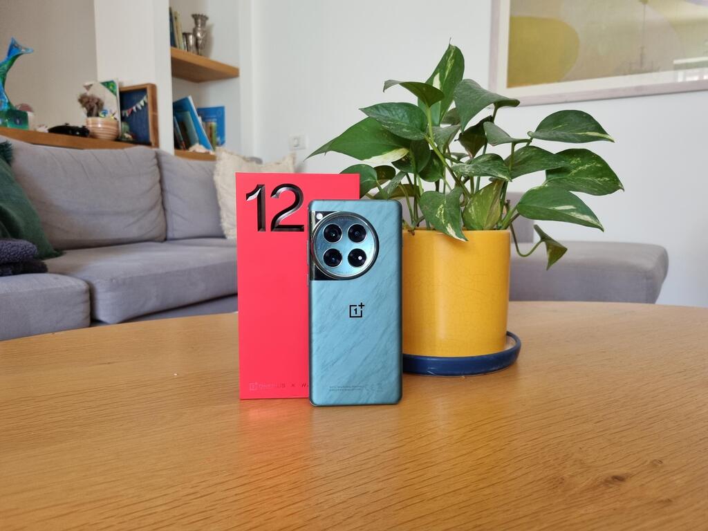
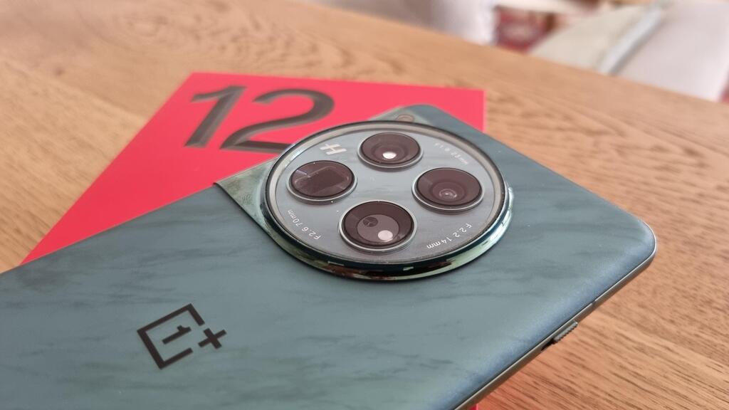
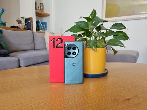
The design of the new model is a little different than usual in the market, but quite normal for the brand. It looks similar to its predecessor, the OnePlus 11: a large device, with a screen that stretches from edge to edge and round edges that slide a little to the sides of the device, and on the back of the device is a large and prominent circle that contains the camera lenses. This circle is massive and prominent, and not everyone will like it - it's a matter of taste.
The color is also different: the back of the device that arrived for testing was green and has what looks a bit like a marble pattern (there is also a black model). The Gorilla Glass comes with some roughness that makes the device more comfortable to hold, unlike other devices with glass backs that feel slippery.
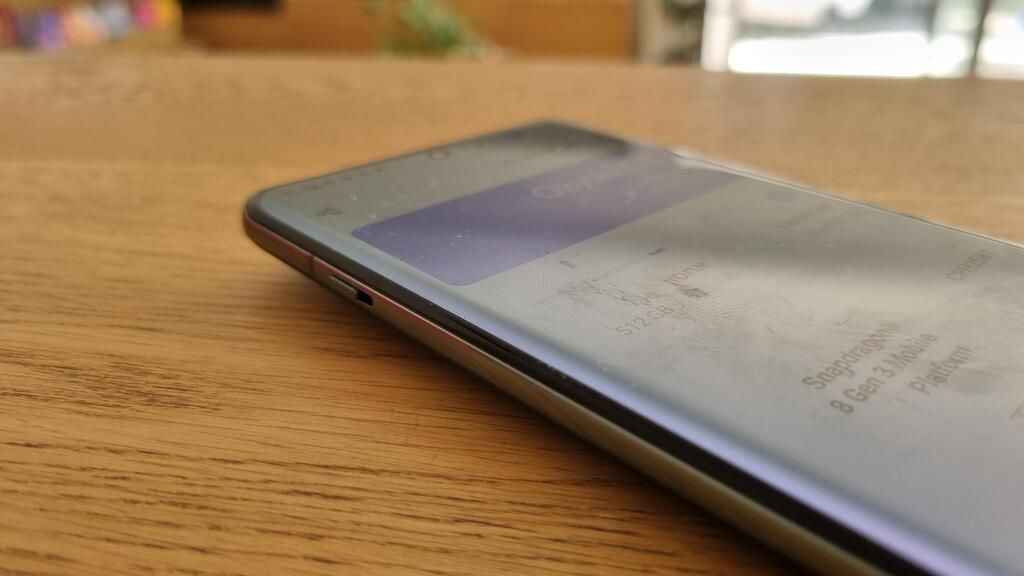
The rounded edges of the screen are also a matter of taste: most manufacturers have already abandoned or are abandoning this design, and it is refined. It did not interfere with working with the device or the display, just a matter of taste.
Another detail that is different on the one hand, but on the other hand normal for OnePlus, is the switch on the left side that allows switching between silent mode, vibration or normal ringing. Beyond this, the design is normal - a power button and volume keys above it, a selfie camera that takes up minimal space at the top of the screen and no connection for wired headphones.
The smartphone weighs 220 grams and this weight is well felt. The screen is protected by Gorilla Glass Victus 2 and the feeling is that the assembly quality is good and the device is durable, but it meets the IP65 standard. The meaning: it is protected against dust and water, but unlike the flagship devices with which it competes, the OnePlus 12 does not claim to survive immersion in water.
Hardware: stronger than the leading competitors
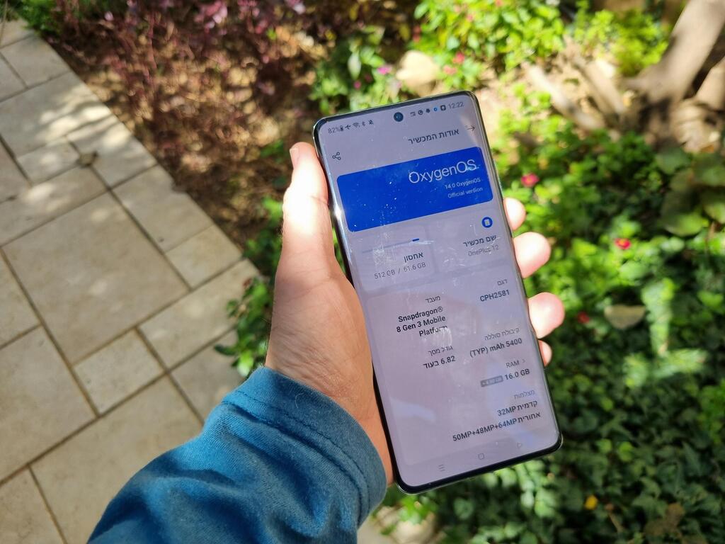
The processor is a Snapdragon 8 generation 3, as in Asus's ROG 8 or Samsung's S24 Ultra (yes, there is a slightly different version there), along with 16 gigabytes of memory - this is already more than Samsung offers in its premium models, and the storage has a volume of 512 gigabytes.
The screen, measuring 6.82 inches, is excellent, with vivid colors, and on paper it reaches an extremely high maximum brightness of 4,500 nits - this figure is also significantly higher than the competition. In practice the display is clear and easy to use even in sunlight. The speakers are also good overall, relative to smartphone speakers.
This dry data translates into a very fast device, which reacts quickly to any action and copes without a problem with any task, including heavy games, and I did not feel that it was heating up.
All of this is powered by a 5,400 mAh battery, which lasted about two days between charges (depending on usage, obviously). When charging with "just" a 65 watt charger, it filled up quite slowly (after about half an hour it went from 15% to 50%), but with a fast 100 watt charger it took just five minutes for the battery to go from 15% to 50% and it took a little more than 20 minutes to fully charge.
The OnePlus 12 also supports wireless charging with a power of 50 watts, if you have a suitable charging surface, and reverse charging, meaning the ability to charge other devices, with a power of 10 watts.
Software and interface: an experience close to a stock Android
The device comes with Android 14 and OnePlus' OxygenOS interface, which offers a version close to a stock Android. On first activation, you can choose whether to use finger gestures to navigate the system or the buttons displayed at the bottom of the screen, and unlike the competitors, there is no indication of the desired direction from the manufacturer's point of view. In any case, you can change at any moment.
After activation, you will discover an abundance of Google applications, including a large and prominent folder that contains them on the home screen. There are also several other OnePlus applications, such as a calculator, weather forecast, voice recorder, and also a remote control application for operating various devices in the home, another application that offers various pieces of music that should help you to relax and one more to limit the use of the phone to avoid interruptions. All in all, there is not a big load of unnecessary apps here.
In the settings there are plenty of customization options, most of them are not activated automatically and are somewhat hidden within the menus. For example, you can activate a shortcut that is displayed if you use the fingerprint reader and leave your finger on the screen a little longer - shortcuts will appear around you that you can set in advance and activate with a swipe of your finger. There are other shortcuts - draw O on the screen when the device is locked to open the camera, V to turn on the flashlight and more. It's easy to get lost in the plethora of options and menus, but it's not a must - it's nice to have the option to customize the shortcuts and gestures, and also that they weren't automatically activated.
Camera: high-quality photos and the addition of photo modes
The OnePlus continues the collaboration with the Swedish photography brand Hasselblad. The device has three lenses - 64 megapixels with 3x optical zoom, 50 megapixels for wide-angle photography and 48 megapixels for ultra-wide angle photography, and of course there is also a selfie camera, with a 32 megapixel sensor.
The results show once again that this is definitely enough and you shouldn't be excited by devices that boast 200 megapixel cameras: in daylight the results are excellent, and even at night you will get very good photos.
There are also different filters, of course, and additional shooting modes, including Xpan which is already familiar from previous devices and simulates shooting with an old film camera - including choosing the desired lens and momentarily freezing the frame you took. You can add a stamp to the photos to indicate that you took the picture with a Hasselblad lens, and if you change your mind, you can take it out in editing.
In editing, you can also delete details from the photos, a feature that should not be counted on too much. First of all, there is no automatic identification of the character or object you want to delete and you will have to manually mark what you want to remove. It's not terrible, but the result isn't anything special either - as with most competitors, the deletion is not perfect and leaves a mark. At first glance it may pass, but upon second glance and with the enlargement of the image the change will be easily noticiable.
Another point: the camera menu offers a 6x zoom, and it seems as if the camera is capable of achieving such magnification in a qualitative way, i.e. optically. In practice, the optical zoom is 3x, as mentioned, and beyond that it is a digital zoom, which is not usually highlighted.


