Smartphone Review
Nothing Phone (2): Bridging the gap between mid-range and flagship
“The Nothing offers more than mid-range devices and stands close to flagship status. Yet, despite its background, the brand remains relatively new and must prove its worth over time,” writes Itai Smuskowitz, CTech's smartphone critic
Top Line:
Much of the hype surrounding the Nothing Phone (2) stems from its transparent design and lighting system. However, even ignoring these elements, the Nothing 2 performs admirably. The price has also increased and places it beyond the reach of successful mid-range devices and closer to flagship models like Samsung's Galaxy S23 and certain versions of the iPhone 13. This pricing aligns with its quality - the Nothing offers more than mid-range devices and stands close to flagship status. Yet, despite its background, the brand remains relatively new and must prove its worth over time.
More Smartphone Reviews:
Details:
What do you do after launching a smartphone with a unique design and distinctive features, aiming to generate buzz and offer features that no competitor has? You work on its next generation. A year after the debut of the Nothing Phone, the new model has arrived, simply named the Nothing Phone (2).
Plot Synopsis: Carl Pei, one of the founders of OnePlus, a venture that initially sparked significant attention, departed from his creation about two and a half years ago. This came after the parent company BBK acquired it completely, resulting in the brand losing its independence. Pei relocated to London and established a new venture - Nothing. The initial product he introduced was Bluetooth headphones, followed by the phone. The phone's standout features included a transparent body and a backlight for notifications with varying flashing patterns.
Structure and Design: Transparent and Slippery
The Nothing 2's design evokes similarities with Samsung's Galaxy S23 and S22. Both share features such as the screen's framing, the device's curved lines, and the glass back. While not exactly a budget device, the Nothing 2 isn't fully premium either. Drawing design parallels with flagship devices from a major industry player is undoubtedly a compliment.
The device feels sturdy, with impressive build quality and a slightly heftier weight. It weighs a little over 200 grams, compared to its predecessor's 193.5 grams. The increased weight accompanies a larger screen, growing from 6.55 inches in the previous generation to 6.7 inches now.
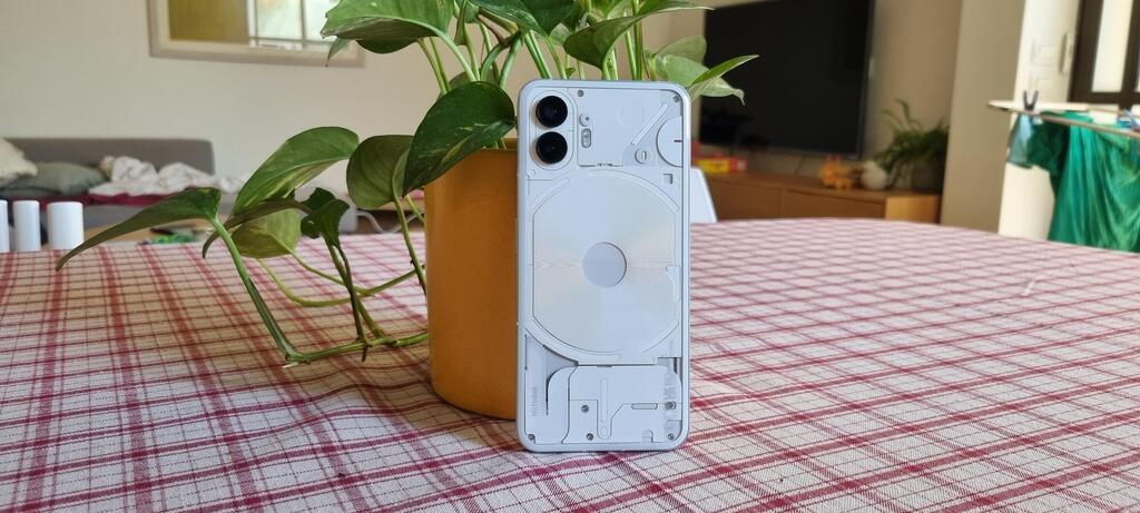
The new model maintains its predecessor's distinctive transparent component display. Notably, there's a lighting system beneath the glass. On the back, several LED lights have been integrated. These lights flash in distinctive patterns based on the situation: a specific pattern for incoming calls, another for WhatsApp messages, different blinking for app updates, and more. Referred to as a glyph by Nothing, this system has been expanded to encompass more scenarios, like displaying volume adjustments or indicating timers visually.
Users can opt out of using the glyph for notifications, have it on only during specific hours, or rely solely on it. Placing the phone face down on a surface triggers silent mode while the lights continue flashing.
This feature is pivotal for Nothing's vision of encouraging users to disconnect from their phones momentarily, setting them aside and checking for updates only based on the light patterns. Personally, I wasn't entirely sold on the idea. My habit of placing the phone face up meant I often missed the glyph notifications. And even if I did see them, checking the message content required flipping the phone over. On the flip side, when the screen was face up, a slight tap would reveal the update.
The glass back of the Nothing 2 is convex, rendering the device slippery. Placing it against your cheek to talk? It slides. Resting it momentarily on your leg or a couch? It slides. Even when connected to a charger and placed on a tablecloth without fully releasing the cable, the device slipped and fell to the floor. Though I was sure it had shattered due to the noise, the Nothing proved its durability, enduring multiple falls.
While the phone feels robust enough to go without a protective cover, hiding a significant portion of its uniqueness (transparent back and lighting), its slipperiness makes a case for finding a long-term cover. The company offers a transparent cover solution, but it's not included in the package.
Addressing protection, the Nothing meets the IP54 standard, capable of handling dust and rain, though not water immersion.
The new phone generally arrives in two models - one with 256 gigabytes of storage and another with 512 gigabytes (a choice not available in the prior model). Both models feature 12 gigabytes of memory and a first-generation Snapdragon 8 processor.
On paper, opting for a year-old processor seems questionable. Devices featuring second-generation processors were introduced six months ago. However, in practice, it's highly unlikely anyone will feel the difference. The system operates smoothly and handles resource-intensive games and tasks without issues. The device does experience a bit of heat after extended play, but not to the extent that it interferes with gameplay or usage.
Carl Pei explained pre-launch that price was a consideration. Opting for a newer processor would have increased the Nothing 2's cost.
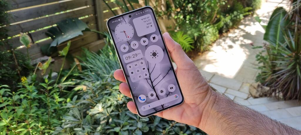
The screen is outstanding. It stretches to the device's edge, framed by a thin border. Displaying rich, vivid colors, its brightness holds up well, even under direct sunlight.
At the screen's bottom is a fingerprint reader, functioning seamlessly. Additionally, face recognition works well. What's absent? A memory card slot, a feature gradually disappearing from smartphones, and there's no standard headphone jack. eSIM functionality is also missing, limiting options while traveling abroad.
The Nothing 2 arrives with a charging cable but without the charger itself. The device supports 45-watt charging, theoretically filling the battery in 55 minutes. However, even with a 65-watt charger, it took longer. For example, going from 10% to 50% required nearly 40 minutes. The device also supports 15-watt wireless charging.
It features a reasonable stereo speaker. Sound isn't overpowering, even at maximum volume, and the quality is unremarkable. This is where the Nothing Ear headphones come into play.
Software and Interface: Nearly Clean Android
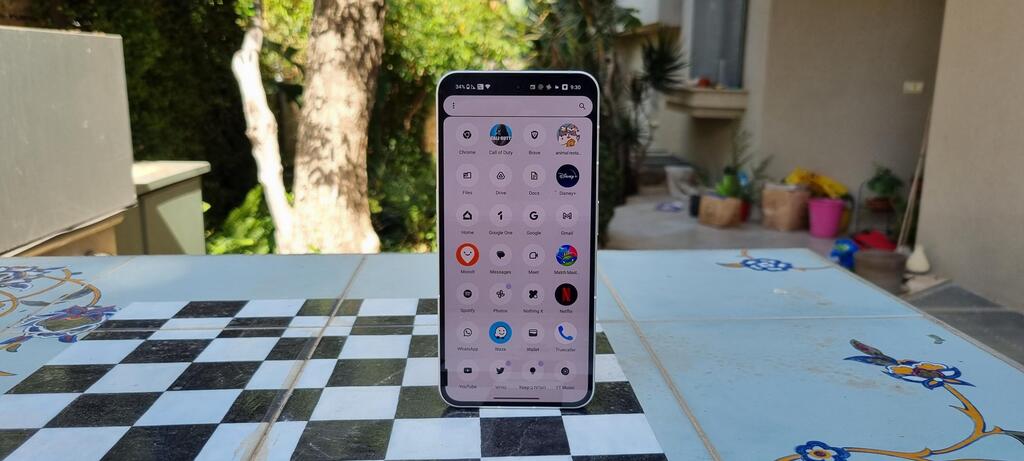
The operating system is Android 13 with the Nothing OS 2.0 interface. This name is fitting, as it's nearly inconspicuous. The interface mainly presents Android in a close-to-stock version, supplemented by some manufacturer-specific additions. This combination ensures regular and relatively prompt system updates. The company guarantees three years of significant updates and four years of security updates.
Much of it resembles the Android found on Google's Pixel devices: a bottom search bar, gesture-based navigation, an app drawer, and more. What sets it apart? Nothing's unique font, reminiscent of old dot matrix printers, black-and-white icon displays, and a handful of widgets and pre-installed apps. These include a calculator, weather app, and a headphone control app, even if you don't own the headphones.
The display can be customized, and it's advisable to do so. While the black-and-white concept is a clever gimmick, finding apps when they all look identical proves challenging. Interestingly, even when I opted for the black-and-white display, some apps appeared in their original colors.
For glyph users, an app is available to craft personalized alerts. Users can create sequences of flashing lights and associated sounds, recording and applying them as custom alerts. There are five sound sets and six lighting zones to choose from.
Camera: Impressive, with Limited Add-On Options
The rear of the device houses two 50-megapixel lenses for wide-angle and ultra-wide-angle photography, mirroring the previous model. The selfie camera has been upgraded to 32 megapixels from 16 in the initial generation.
In practice, default photos are 12 megapixels. Opting for a 50-megapixel image requires manual selection within the camera menu. Additionally, image ratios (3:4, 9:16, etc.) can't be changed, and there's no zoom function. The photo application's options menu seems sparse compared to competitors, with fewer photo modes and filters.
Again, these are technical details. The camera produces excellent images even in the default setting. It retains colors well and offers both 2x and 10x digital zoom. While manual night mode is absent, the camera self-adjusts based on lighting conditions, yielding favorable outcomes.


