Smartphone review
A solid contender in the mid-range market: The Oppo Reno 12 reviewed
Examining the Reno 12's overall performance, its unique features, and what it means for future mid-range.
Top Line
Oppo's Reno 12 does not particularly stand out against the competition, of which there are many. In terms of pricing, it is positioned reasonably well in the mid-range at under $500, which is a fair price given its specifications and capabilities compared to the competition.
There is no single standout feature that "justifies" a purchase: it is lightweight and offers a large screen, but the choice of a curved screen can sometimes prove unsuccessful. It has good protection and a cluttered interface, as mentioned, presenting an interesting approach to integrating AI and some useful features in that domain. However, it remains unclear why users must make an effort to locate and activate these features.
In summary, this is another strong contender in the mid-range device market, albeit with some issues to consider.
Structure and design: Demonstrating the need for change
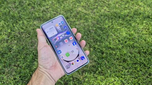
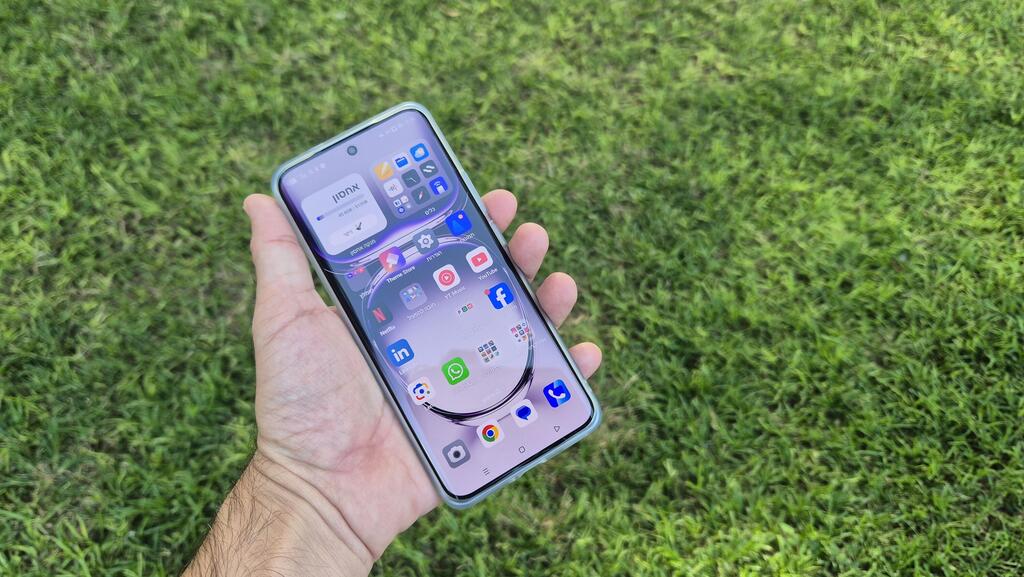
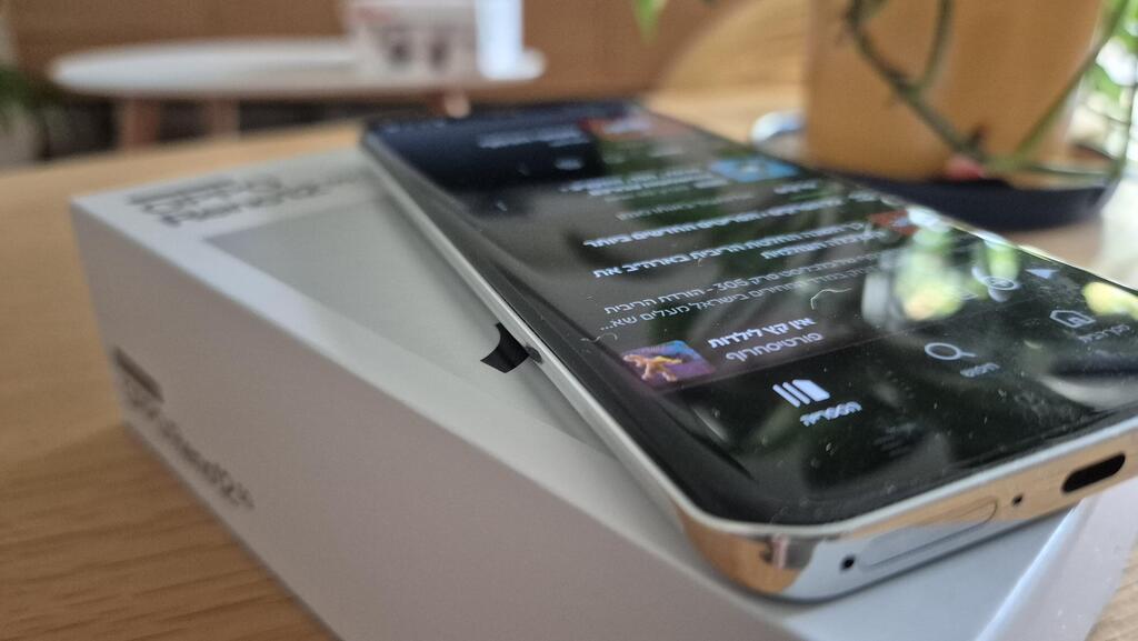
The Reno 12 is quite a large device, featuring a 6.7-inch screen and weighing just under 180 grams—it doesn't feel heavy and is generally comfortable to carry. Oppo has incorporated a curved screen into the device, with rounded edges—an option that is disappearing among manufacturers. In the past, I have tried such devices and found little difference compared to a completely flat screen, noting that it is a matter of personal taste. However, the Reno 12 highlights the issues associated with curved screens.
For example, when I selected a song on Spotify and went back to holding the phone from the sides, I occasionally accidentally clicked on another song—even when I was trying to touch only the frame surrounding the screen. In several games and applications, I encountered buttons located at the edge of the screen, making them difficult, if not impossible, to use due to the curvature. In short, it may be time to switch back to a flat screen.
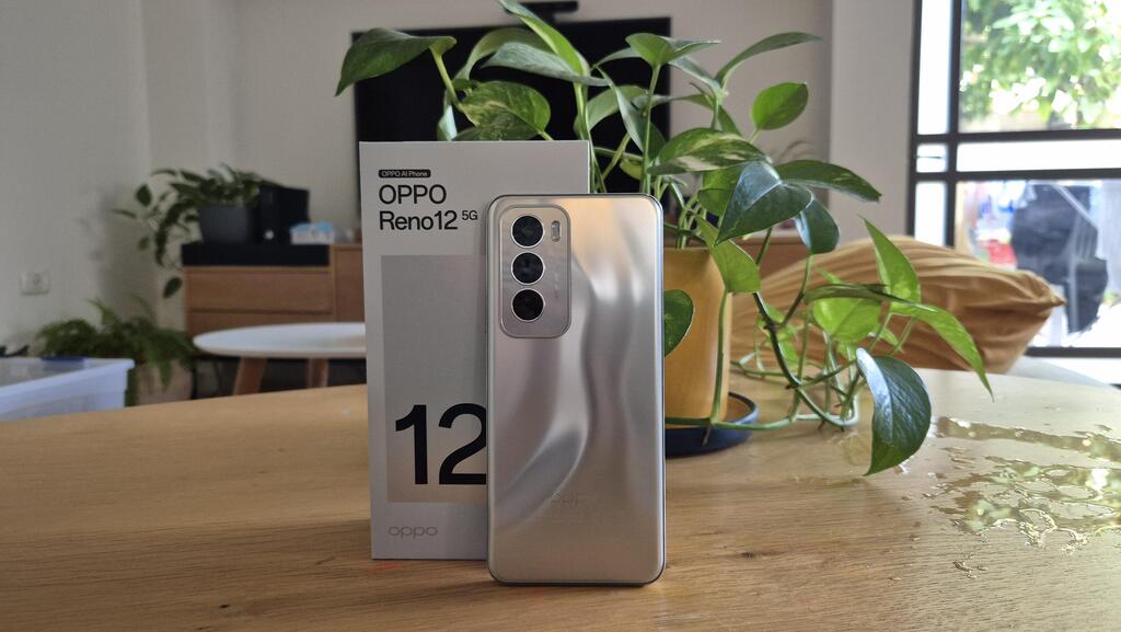
The back of the device is made of plastic and feels smooth, despite having a wave-like effect, and the three lenses are arranged in the upper left corner, similar to Samsung's Galaxy devices.
The frame is also made of plastic, and the screen is protected by Gorilla Glass 7i—a version launched by Corning, the manufacturer of Gorilla Glass, concurrently with the launch of the new Oppo device, designed to offer good protection for mid-range devices. The device meets the IP65 standard, which is sufficient for dealing with water and dust, but not for immersion. For added safety, the kit includes a basic silicone protector with a rough back.
Hardware: Strong enough and fast charging
The device is powered by a MediaTek Dimensity 7300 Energy processor, and it has 12 gigabytes of RAM (which can be expanded at the expense of storage) and 512 gigabytes of storage. Next to the SIM card slot, you can add a memory card to increase storage capacity, but the device does not support eSIM.
The addition of "Energy" to the processor's name suggests it is more efficient in terms of power consumption, but I did not notice any unusual results. The Reno 12 has a 5,000 mAh battery that lasts about a full day, similar to many of its competitors—even those without a processor bearing the "Energy" label. The kit includes a fast charger with a power output of 80 watts, and charging is indeed quick: after about 15 minutes, the battery charged from 15% to 50%, and a full charge took 40 minutes.
Overall, the screen is successful: the brightness is strong enough to allow for viewing and reading even under direct sunlight, and the color reproduction of photos and videos is very good. The speakers produce a strong sound but lack high quality, with a tendency towards excessive treble. Additionally, there is no option to connect wired headphones.
With all this data, the Reno 12 demonstrates good performance: it responds quickly, handles everyday tasks efficiently, and runs heavy games without issue.
Software: A cluttered interface that hides AI tools
The Reno 12 is based on Android 14 with Oppo's ColorOS 14.1 interface. For a moment, I thought about complimenting the company: during device activation, an offer appeared to install a selection of apps. However, it quickly became clear that this was merely an option; you can choose to install only some of them or skip all of them with the click of a button. This gives the impression that the consumer has a choice, whereas some competitors simply pre-install apps whether you want them or not.
After activation, it turned out that several applications were already installed—Spotify, Snapchat, Netflix, WPS Office, LinkedIn, and more—and on the main screen, there were several folders labeled "Must Run," "Hot Apps," and "Hot Games." In some of these folders, you will find pre-installed games, while in others, there are merely recommendations for additional installations. The result is home screens cluttered with unnecessary apps and suggestions to install even more.
Beyond this, the interface allows for customization: you can show buttons for navigation or use finger gestures, display apps on the main screen and in the "application drawer" or opt to forgo the drawer, and add shortcuts in the notification curtain, among other features.
At Oppo, they emphasize AI capabilities in photography, but other artificial intelligence features are hidden away. It wasn't until a few days of using the phone and exploring the settings menu that I discovered how to enable the AI features. By default, these features are not activated—a reasonable choice—but I did not encounter any hints about their existence or offers to activate them.
The AI options are located under "Smart Sidebar" in the settings menu. After activation and confirming that the system will check what is displayed on your screen, the sidebar becomes available—similar to the side menu that Samsung offers for various shortcuts.
So, what do we have here? At the top of the sidebar, two "smart functions" are available: the first is an AI reader, which quickly scans text in the browser (a bar appears that scans the text) and provides an audio version. You can click on a paragraph and choose whether you want a male or female voice, and the system begins reading the text. It works smoothly, but it narrates every word that appears on the screen, even those linked to additional articles.
The second function is an AI-based summary, which works similarly to the system Samsung integrated into the Galaxy S24 earlier this year. Like the text reader, the system quickly scans the text and presents a summary in bullet points.
There is an interesting approach here, with an advantage over Samsung's AI: while Samsung offers its AI tool as part of its browser, keyboard, and notes app, Oppo provides a floating bar accessible in every browser and other relevant applications. So why hide these tools? In Israel, it may be due to the lack of support for Hebrew.
The sidebar also includes an option to translate the screen, which is simply an integration of Google Lens, allowing support for Hebrew and the ability to translate text into various languages at the click of a button.
The smart functions only appear when they can assist, meaning the system checks what is on your screen. If you open the sidebar while using an unsupported app or on the home screen, you will still see the option to translate the screen, but the AI reader and summary will disappear, leaving only shortcuts to different apps in the bar.
Camera: Good photos, partial editing success
The device features three cameras: a main 50-megapixel sensor, an 8-megapixel ultra-wide camera, and a macro camera with only 2 megapixels. Additionally, there is a selfie camera with a 32-megapixel sensor. If you choose high-resolution photography (50 megapixels), there is no zoom option; however, without high resolution, there is 2x optical zoom. The images produced by the lenses are good, though not outstanding—they lack sharpness and vibrant colors, but overall, they perform adequately.
Here too, Oppo has integrated AI tools for photo editing and enhancement. The device includes a tool for removing details and people from photos, a feature available on many Android devices (and now recently introduced on the iPhone). I found the deletion feature on the Reno 12 to be a pleasant surprise—even in a busy photo, the system automatically recognized the people, and the deletion left no traces behind. Long-pressing a person in the photo opens a menu that allows you to turn the photo into a sticker.
However, there are features that do not perform as well: in group photos, the system is supposed to detect if someone has closed their eyes and correct the photo. Even when I intentionally closed my eyes, a message appeared stating that no closed eyes were detected. There is also a tool designed to enhance faces, presumably based on the assumption that someone will move during a group photo, but I did not notice a significant improvement in the results.
As if that weren't enough, there is also Studio AI, an application containing a variety of images of different characters, to which you can superimpose your face. While it may be a fun gimmick for a short time for a certain audience, it doesn't seem particularly useful beyond that.


